Trans-seasonal Unisex Fashion,
Hoodedwept.
ABOUT HOODEDWEPT
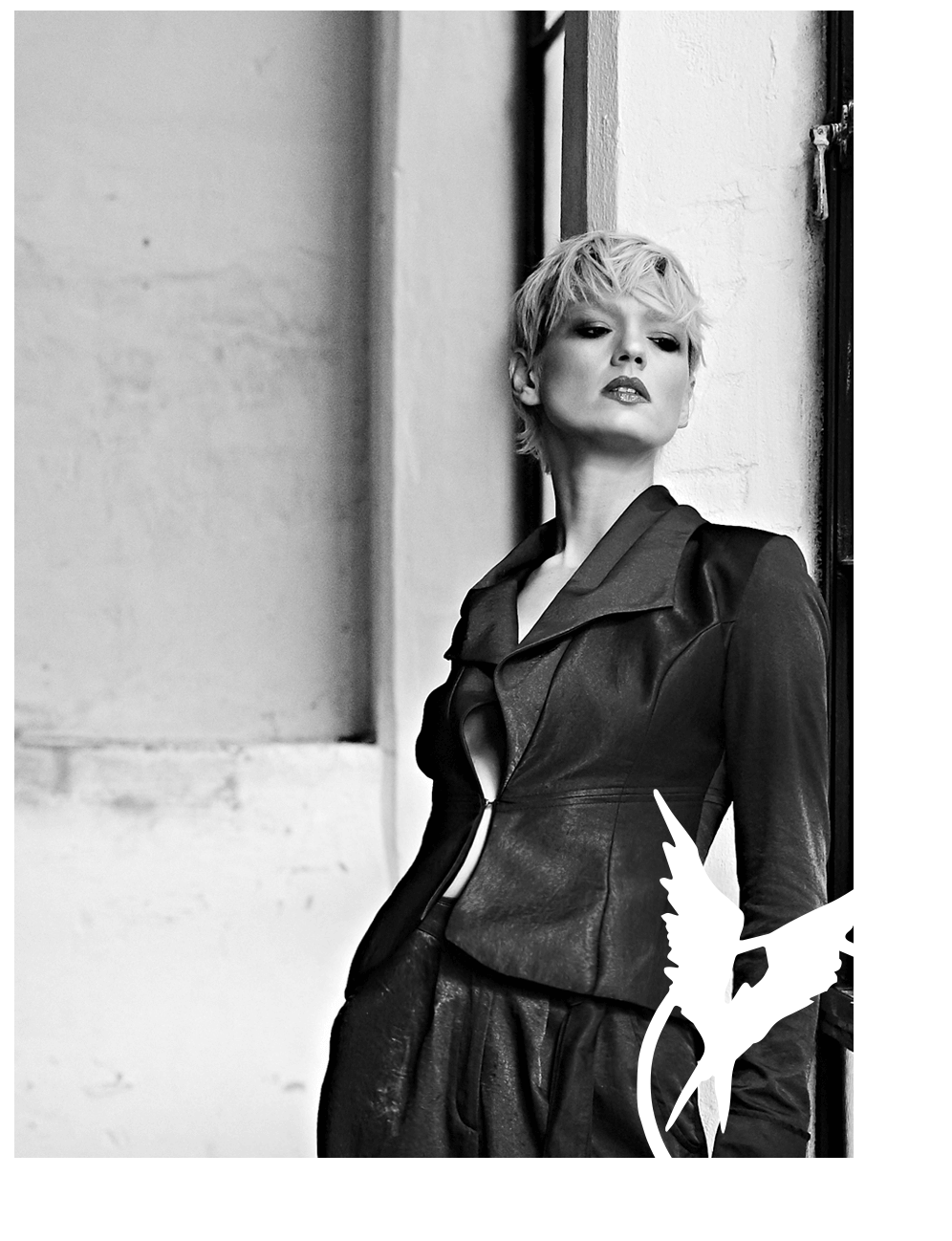
Hoodedwept is a directional concept brand producing trans-seasonal women's / men's / unisex collections.
Hoodedwept balance a distinctly Eurasian avant-garde aesthetic with clean, modernist styling, providing a space for those who wish to explore their style and ideas beyond the norms of conventional fashion. Drawing from these cornerstone values of expression and the importance of story, they work largely within a monochromatic palate, using muted colour and dull metallics to accent their ranges.
Each collection the brand creates is designed, developed and made in Australia at their HQ showroom by a team of specialist garment professionals with a collective experience of over 50 years. In telling their story through clothing it is their goal to help their clients tell theirs.
OUR WORK
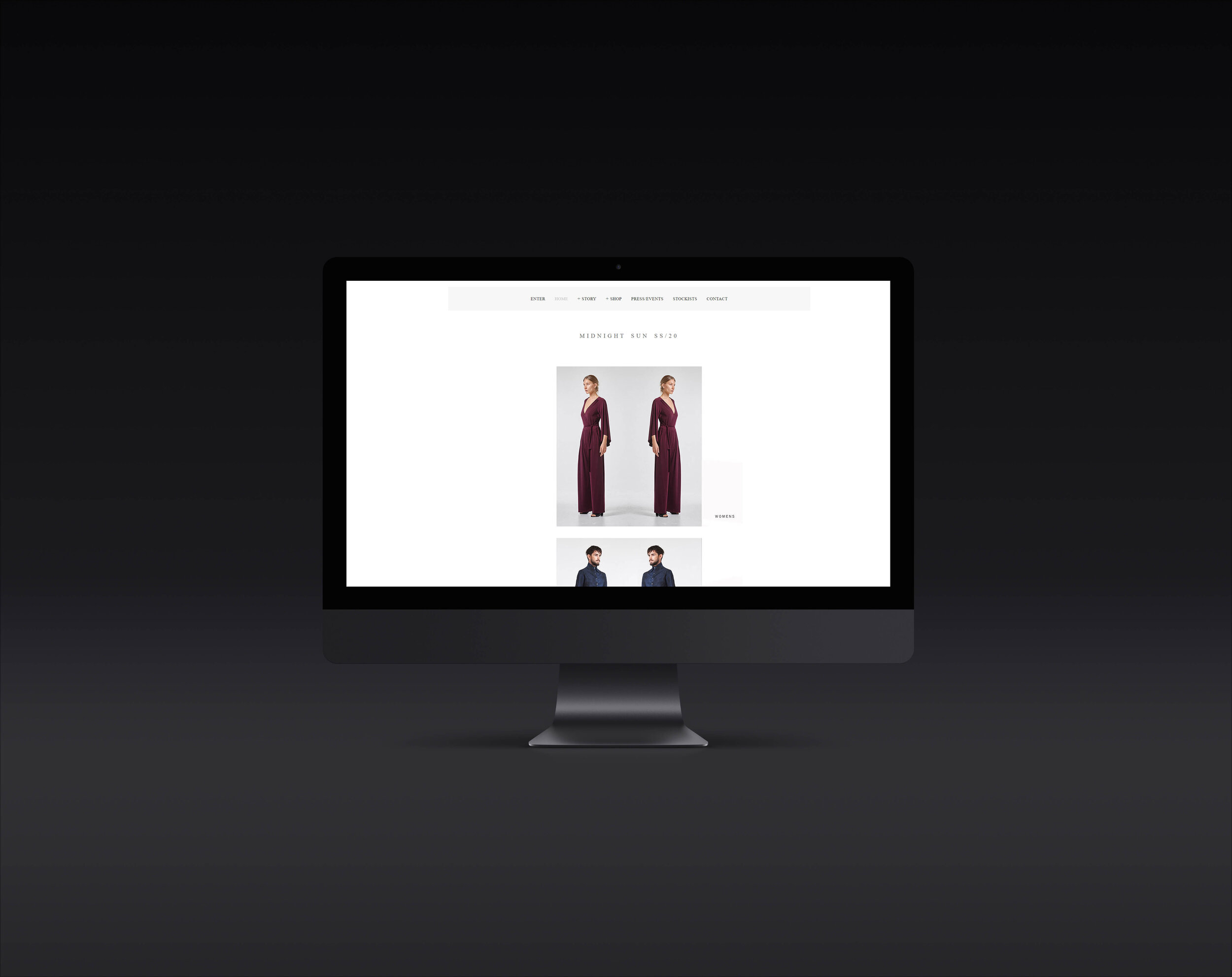
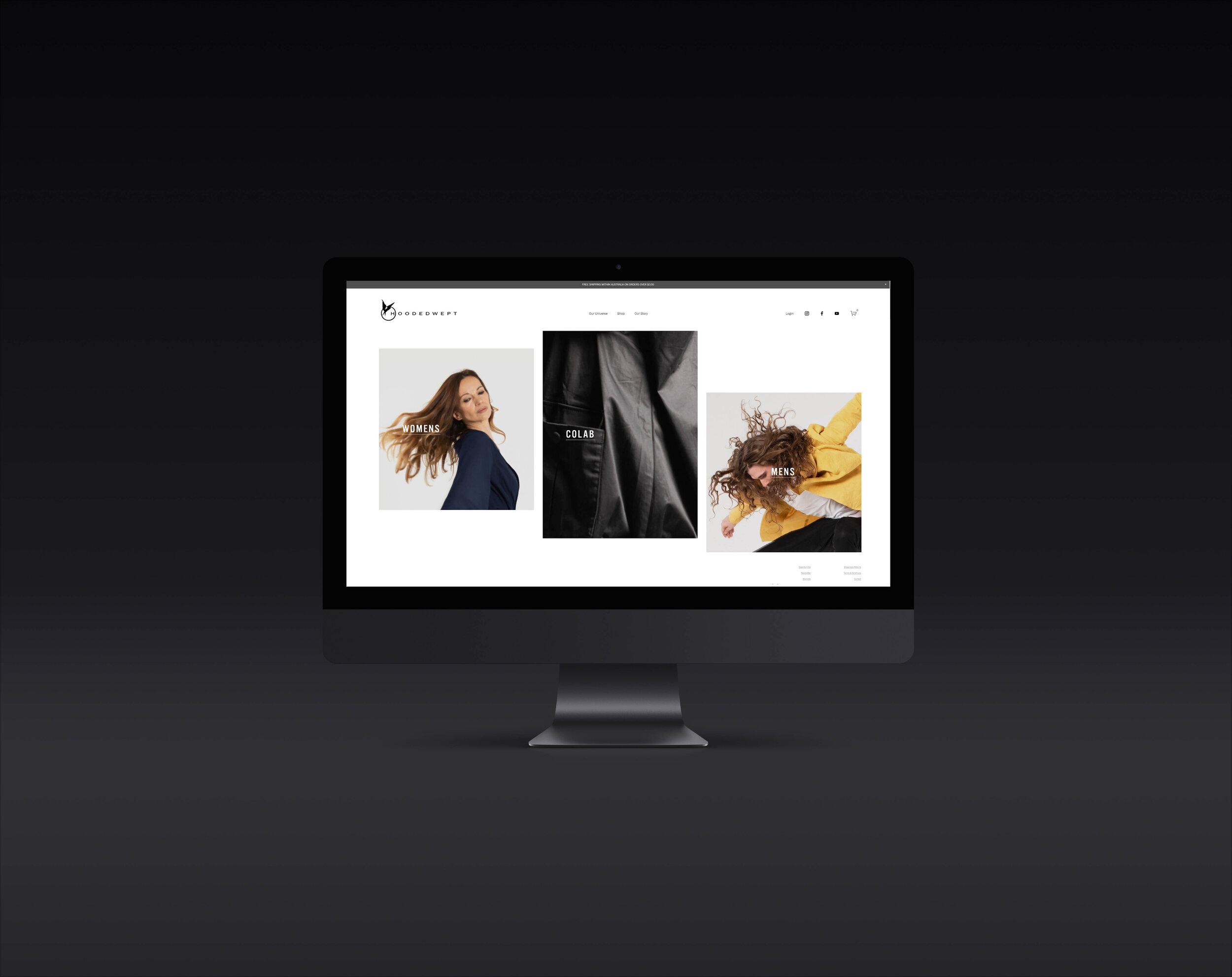
Transferring from Squarespace 7.0 to 7.1
We worked directly with Hoodedwept’s owner, Neil Sheriff to elevate and refresh the visual language of his existing Squarespace website to better speak to their level of work. Our goal was to increase sale conversation by improving:

Site Navigation: By creating a custom dropdown mega menu, customers are able to effortlessly navigate between product categories.

Customer Accounts: Customer accounts are an inexpensive and low friction way to increase customer retention and repeat purchases.

Quick & Easy Flow: By creating this custom menu, we were able to simplify the existing menu and by creating a more minimal design were able to switch from a hovering menu to a static menu. With an ever-present guidepost fixed at the top of the screen, user flows are freed of confusion or immobility.
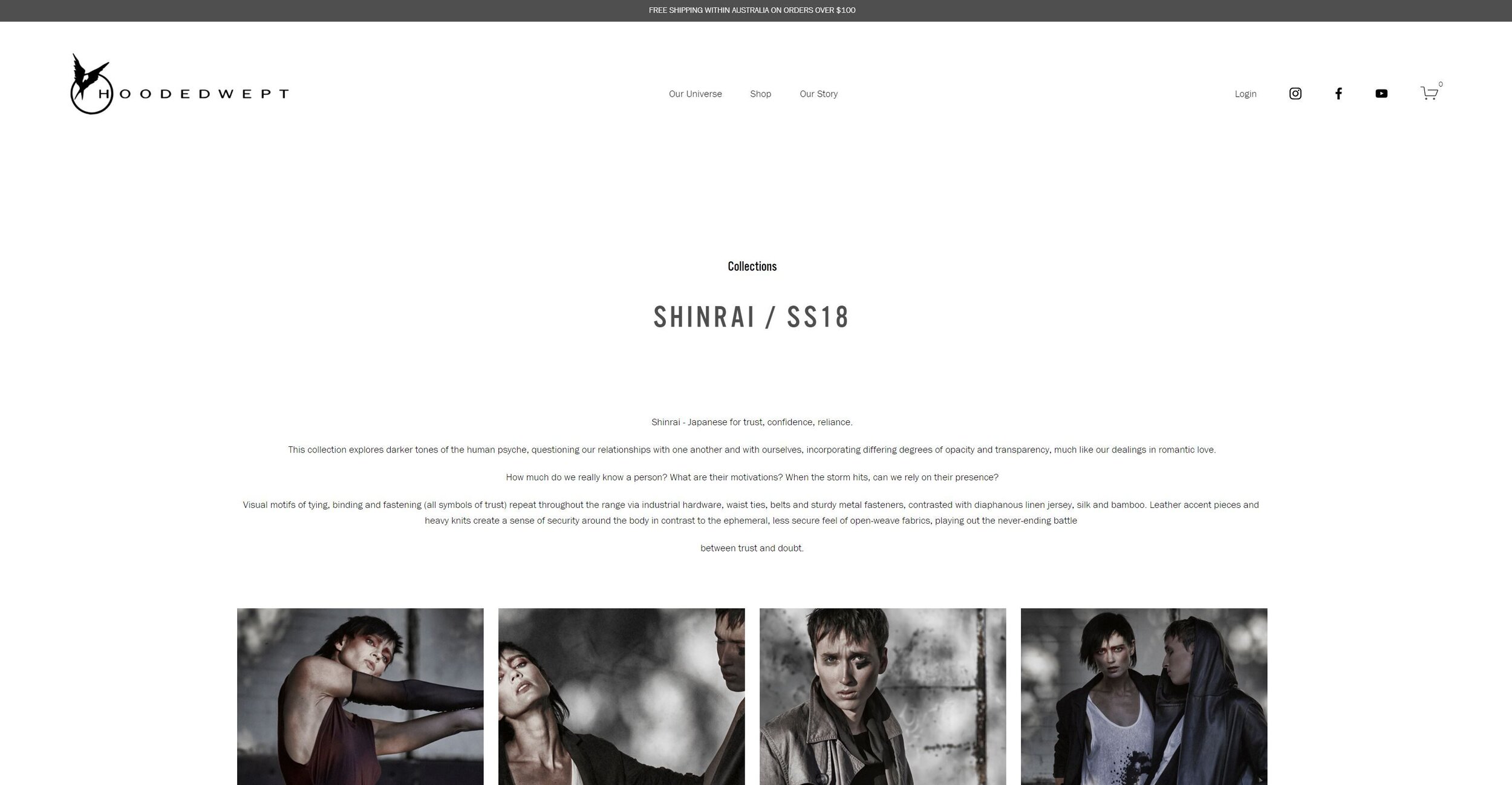
Switch to Sans Serif typeface: The clean lines and sharp edges of our chosen san-serif font not only increases the legibility for users but creates a more modern and approachable brand persona.
From Boxed to Full-Width: The full-width not only gave the site a more creative, modern feel to the website, it become more dynamic, adapting to the width the viewer's screen size.